Graphs and visualisations

Things I've enjoyed making, mostly for fun, sometimes for research

Graphing teenage birth rates

Lowering birth rates across Europe with time

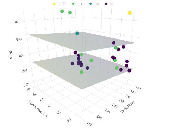
Buying a tumble drier

When you’re not sure what tumble drier to buy, and your methodically-minded wife puts together a spreadsheet of data, why not turn it into a graph? The two planes indicate the increase in price between going low energy-efficiency (B or A+) to high (A++ or A+++).

driers-high-vs-low

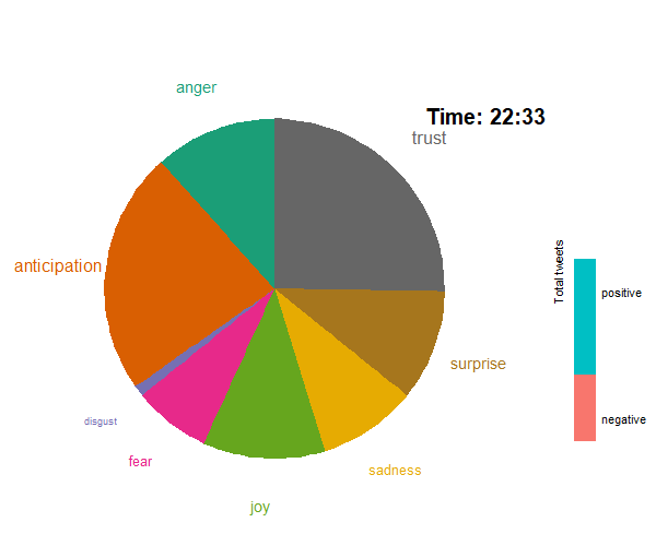
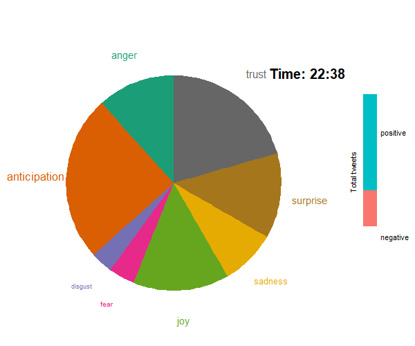
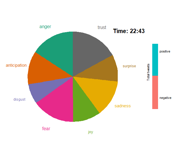
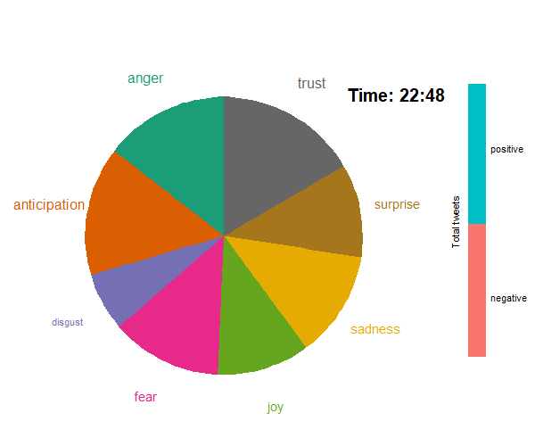
The sentiments of the BBC Question Time audience

A sentiment analysis lets you categorise words and get an impression of how people are feeling when they’re writing. If you stream tweets in five-minute chunks while watching a popular show (using, say, the #bbcqt tag), why not animate how things are going…


Latest Posts

How can I speed up my R code? Part 2

How can I speed up my R code? Part 2

How can I speed up my R code? Part 1

R in Public Health Workshop

On the 28th of May we delivered a four-part workshop on using R in Public Health. You can find all course materials on the GitHub Page and the workshop sessions on YouTube. Below is the Shiny session which I co-delivered.